I am interested in making applications that assist with health communication and advocacy for public health related issues. I have also have experience working on a diversity of issues which uses GIS to solve real-world problems. I believe in empowering individuals and groups to use GIS and data science in a problem-solving capacity and have created educational modules and conducted workshops on data collection and mapping.
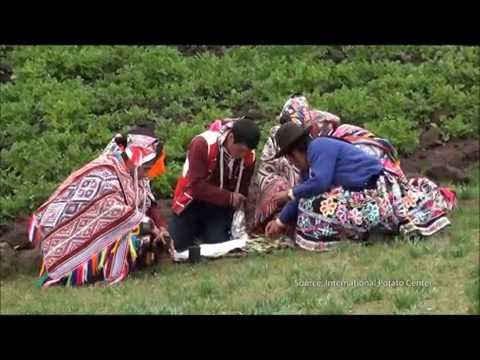
In summer 2016, I was part of a team that worked on the third and final iteration of the Peru Climate III project. We collaborated with the International Potato Center and Asociación ANDES to assist indigenous farmers in Parque de La Papa in Peru with potato cultivation. We did this by creating a suitability model and risk assessment to identify areas which are suitable for potato cultivation and areas which are at risk of being unsuitable. I also created a tutorial on the potato suitability and risk assessment models for GIS analysts who work at the International Potato Center.
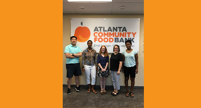
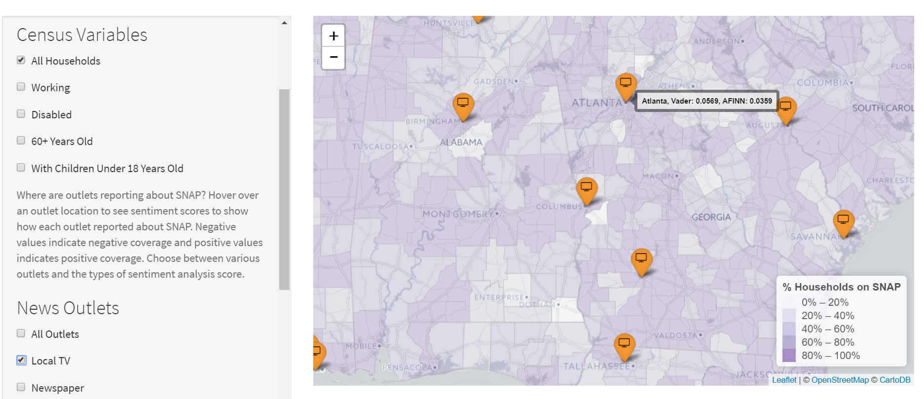
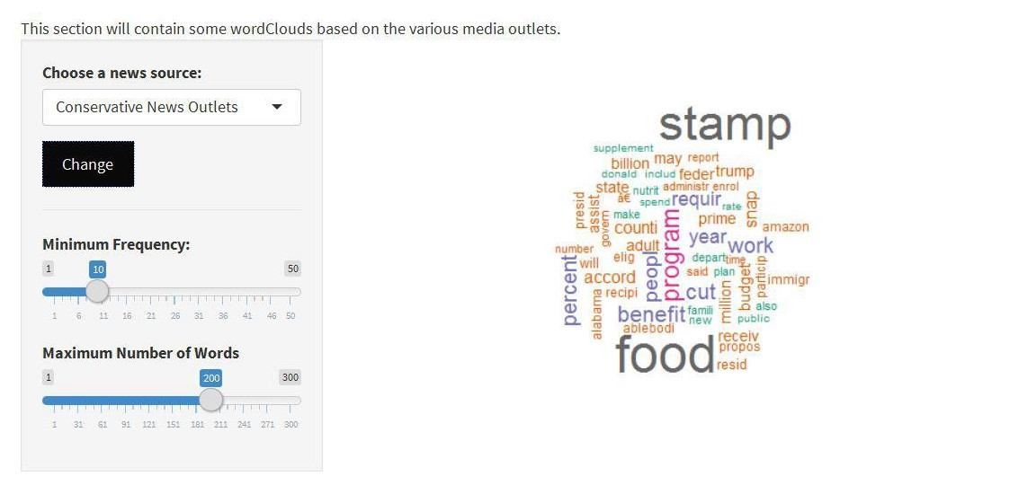
This project explores public opinion on the Supplemental Nutrition Assistance Program (SNAP) in news and social media outlets, and tracks elected representatives’ voting records on issues relating to SNAP and food insecurity. We used machine learning, sentiment analysis, and text mining to analyze national and state level coverage of SNAP in order to gauge perceptions of the program over time across these outlets. Our final results are displayed in four R Shiny apps that the Atlanta Community Food Bank Advocacy Team can use to inform their communication to relevant stakeholders. I was responsible for creating an interactive map app which shows the results of the sentiment analysis and and a WordCloud app in which one can see the most frequent words about SNAP by news outlet.
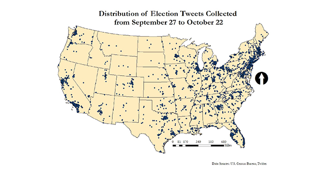
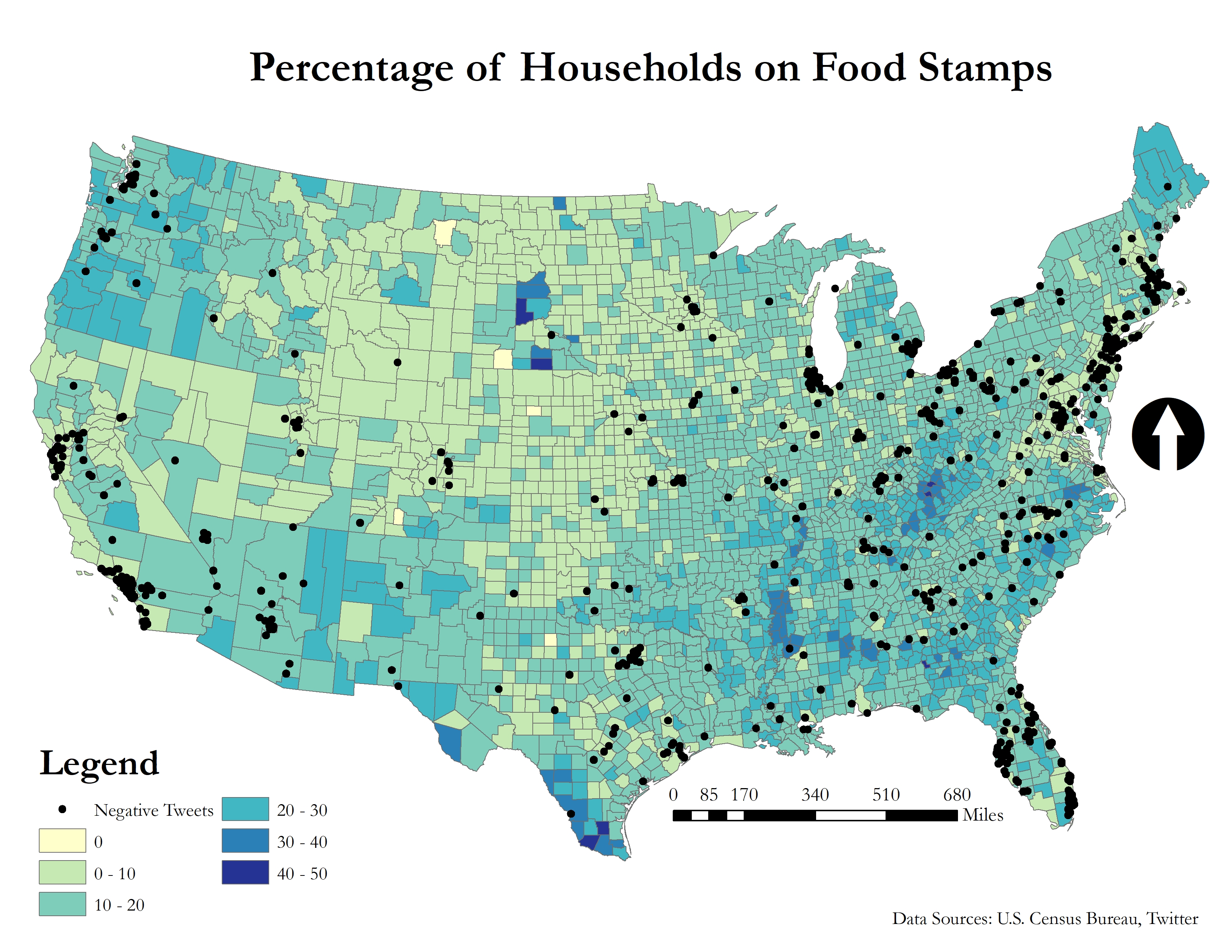
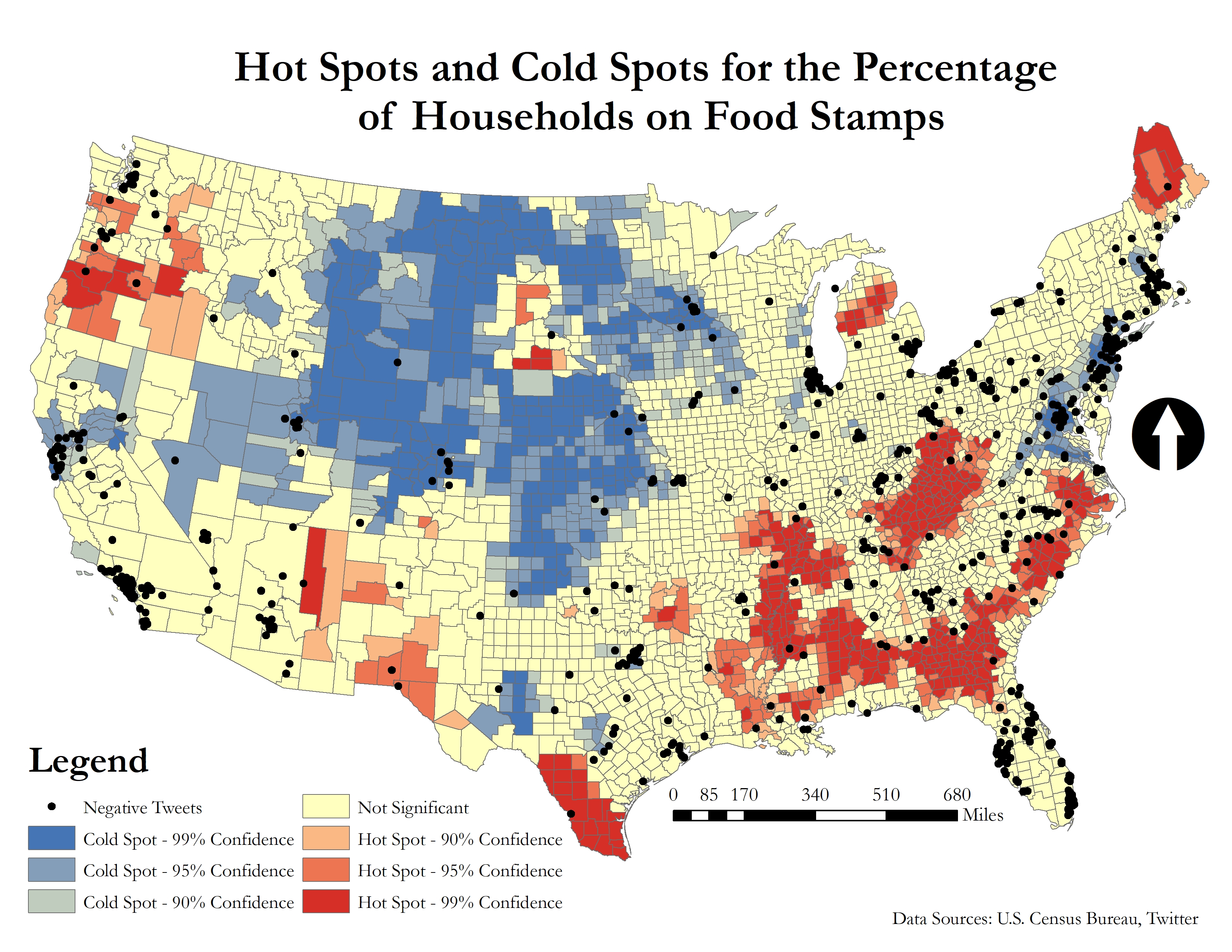
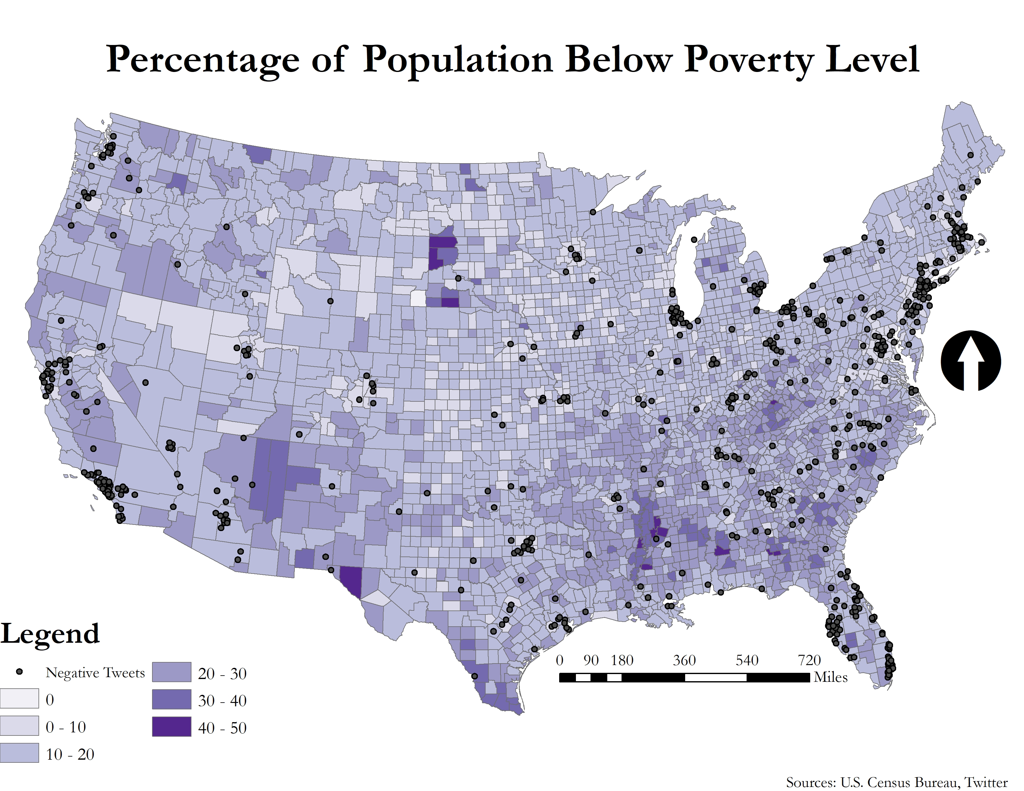
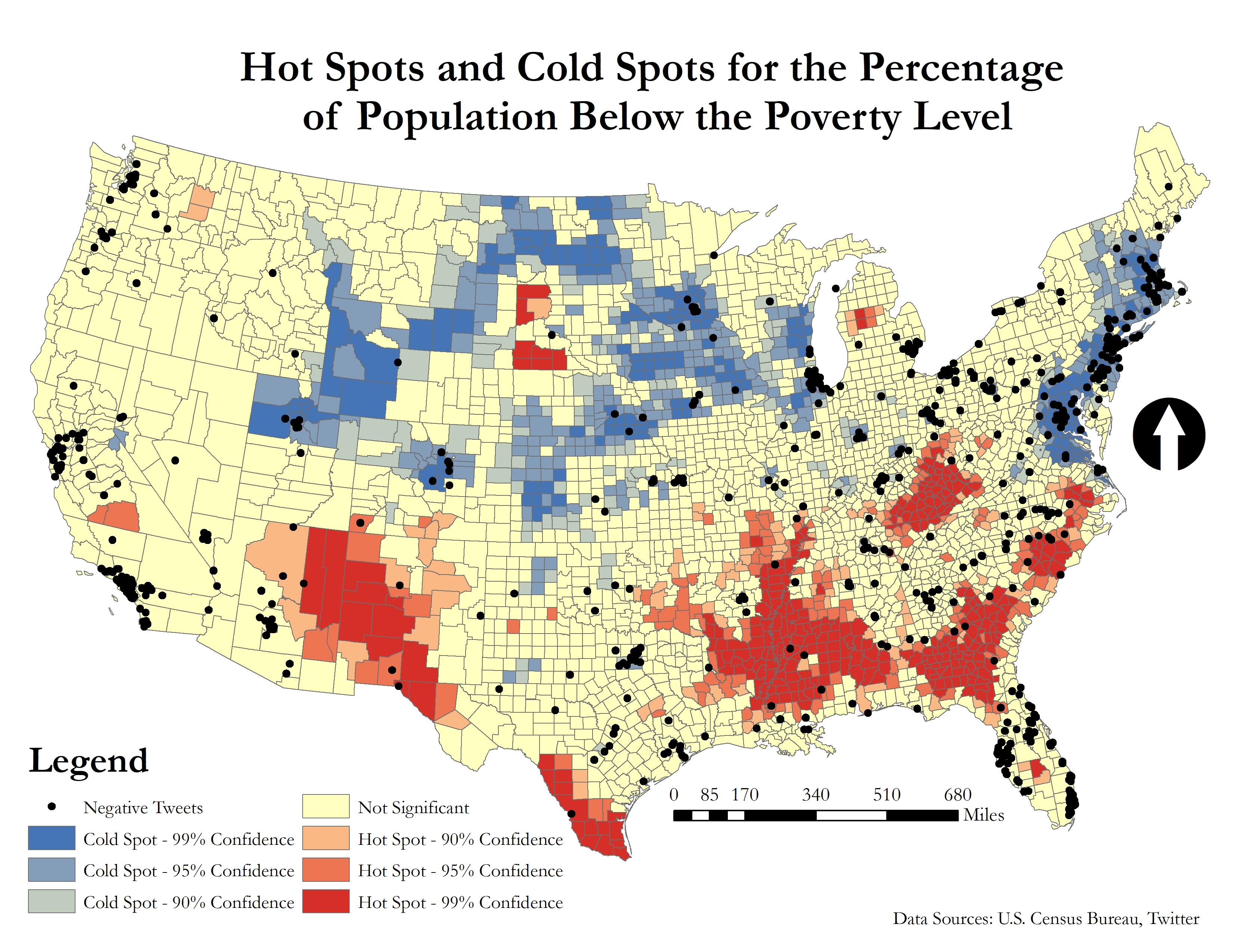
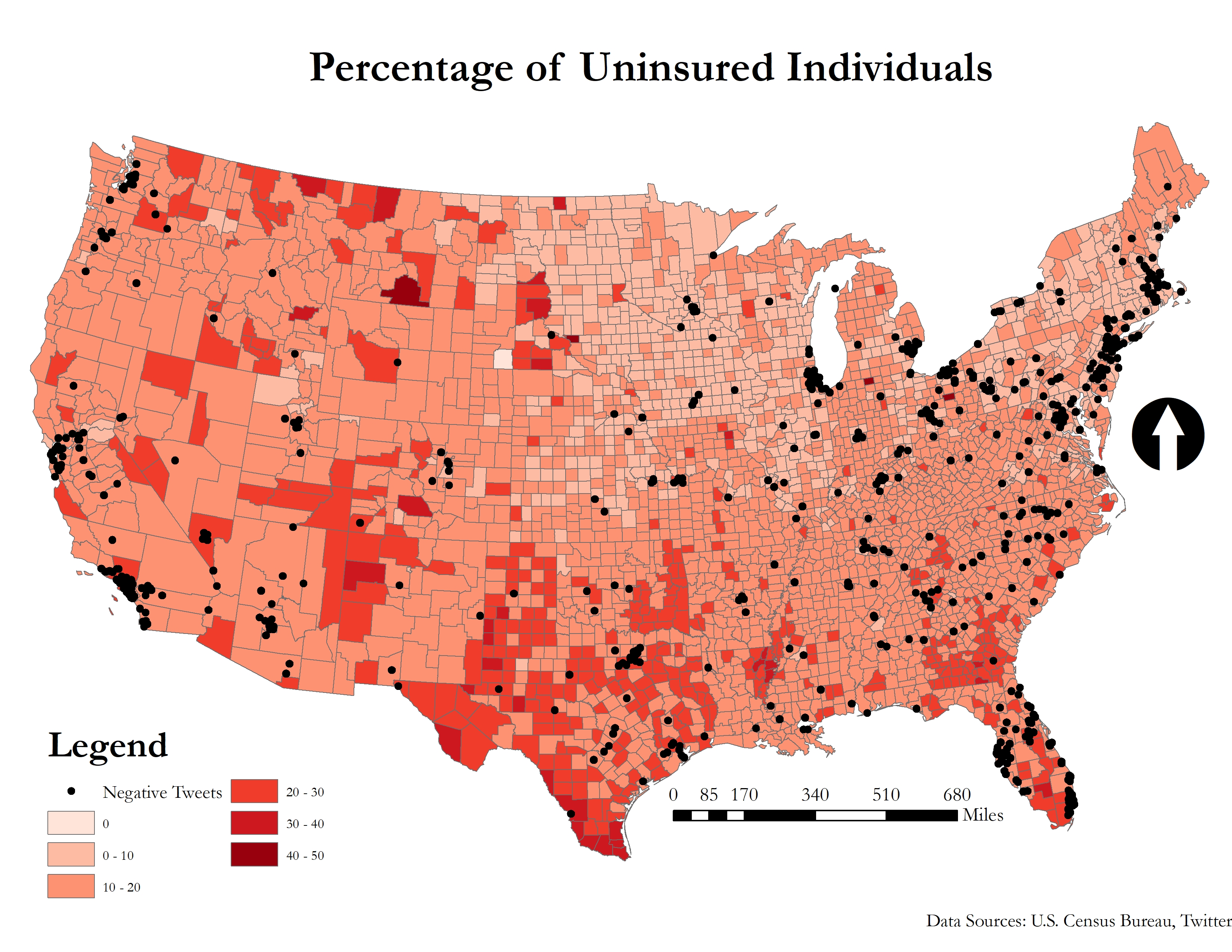
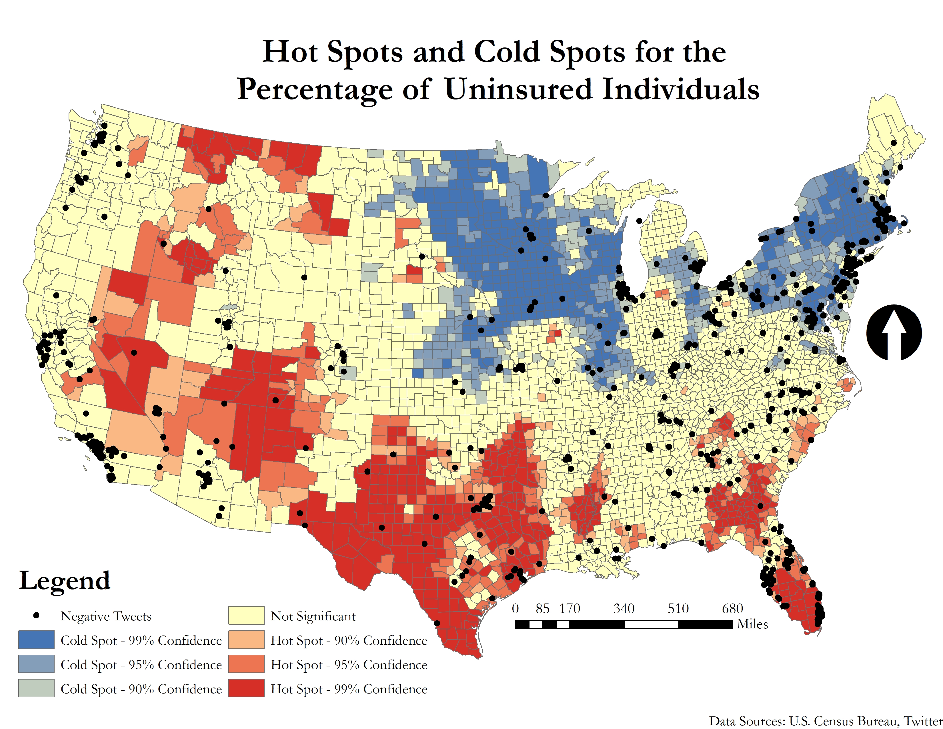
This project explored the spatial distribution of negative election-related tweets in the US and to see if there is any correlation to the percentage of individuals that are below the poverty line, the percentage of individuals who are uninsured, and the percentage of households that are on food stamps. Machine learning algorithms categorized the tweets based on sentiment and political candidate. In addition, geostatistical techniques were conducted on the tweets to determine if there is a clustering of tweets. Results indicate that negative tweets were concentrated in areas which fare better in quality of life and well-being. In areas in which the quality of life and well-being is lower, there were not as many negative tweets or no tweets at all which indicates a digital divide between these areas. Overall, this study shows both the potential and limitations of using social media data in GIS analysis and emphasizes the importance of the researcher to keep the social issues and implications of this data in consideration when incorporating it in their research.
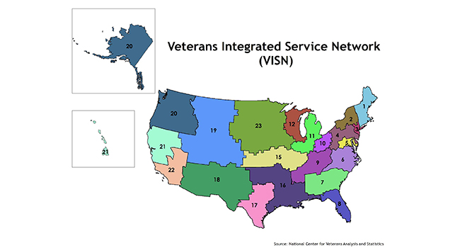
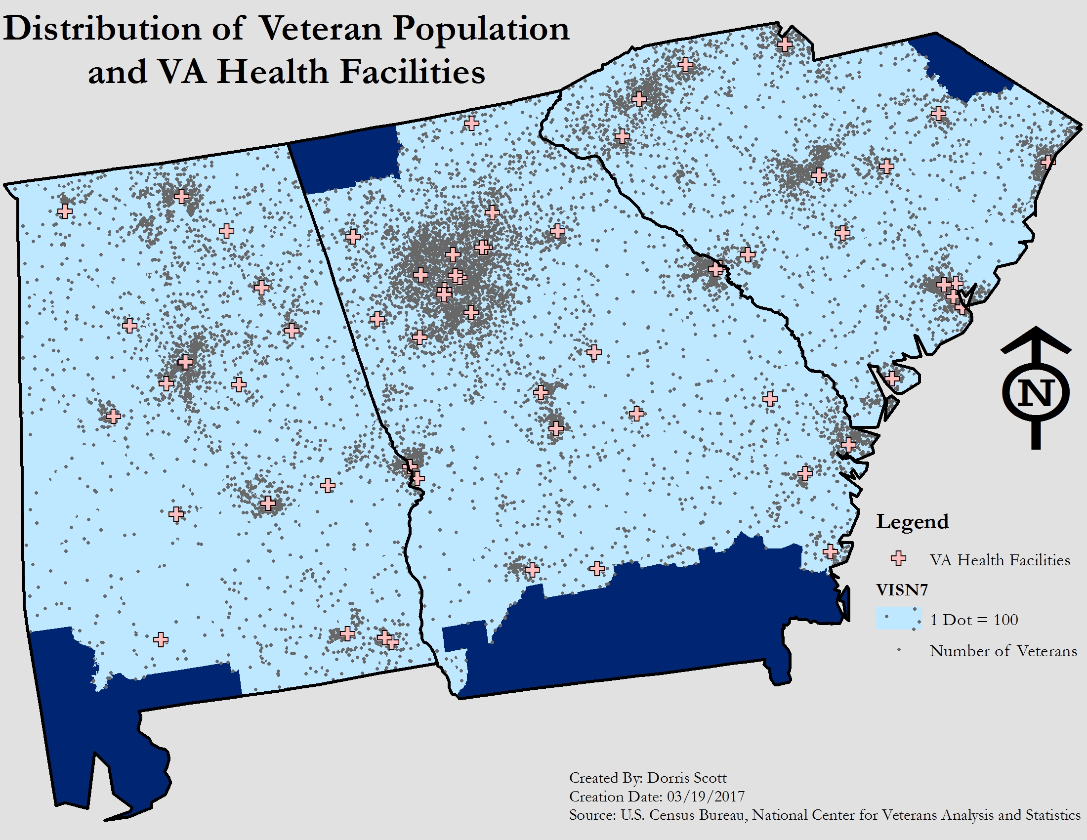
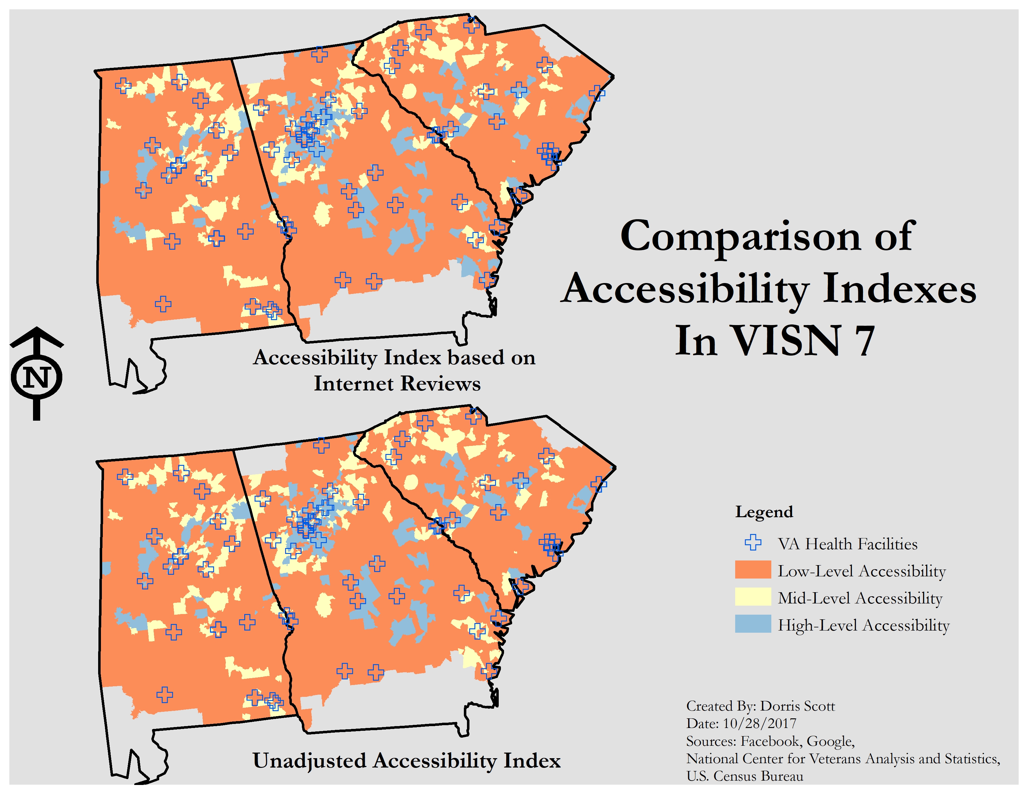
Incorporating Patient Satisfaction in Health Accessibility Modeling for VA Health Facilities
My current research revolves around incorporating non-traditional data sources such as Google Reviews and Facebook and traditional data sources such as VA patient surveys in accessibility modelling for VA Health facilities. Particularly, my research focuses how social media, internet review data, and government data can be used with GIS to help patients be better informed about VA health facilities and the overall performance of their Veteran’s Integrated Service Network (VISN) compared to facilities in other areas and networks. Preliminary results indicate that accessibility mostly was unchanged but did change in a few areas. Moving forward, this project will focus on spatial accessibility of both VA and non-VA health facilities for women veterans. Ultimately the results of this research will be integrated in an app tailored for women veterans to use for decision-making in regards to health and wellness.
I have made some tutorials on R; namely how to collect tweets and to map them on Leaflet.
From App to Map
This tutorial was initially created for the Programming for GIS class and was modified for a workshop I did at the We Rise Tech conference which took place in Atlanta, GA in June 2017. The first part of the tutorial goes over collecting tweets using the the TwitteR package and the second part of the tutorial goes over mapping collected tweets in a Leaflet map.
This course goes over mostly the same thing as From App to Map but uses the rtweet package. This course was created using instructional design. I used a modified version of the ADDIE (Analysis, Design, Develop, Implement, Evaluate) model in order to make this course. This course is divided into three units which goes over how to collect tweets, display them on a leaflet map, and how to create an R Markdown document and an R presentation. Feel free to use the materials for your workshops or classes, but please give credit where it’s due!
This Shiny app was created to show the data that was collected from the Athens Wellbeing Project. The purpose of the Athens Wellbeing Project is to provide data about the Athens community which will allow community members and organizations to make more informed decision-making. The data that was used for the Athens Wellbeing Project came from surveys given to households in Athens-Clarke county and secondary data sources such as U.S. Census data and Clarke County school district data.